
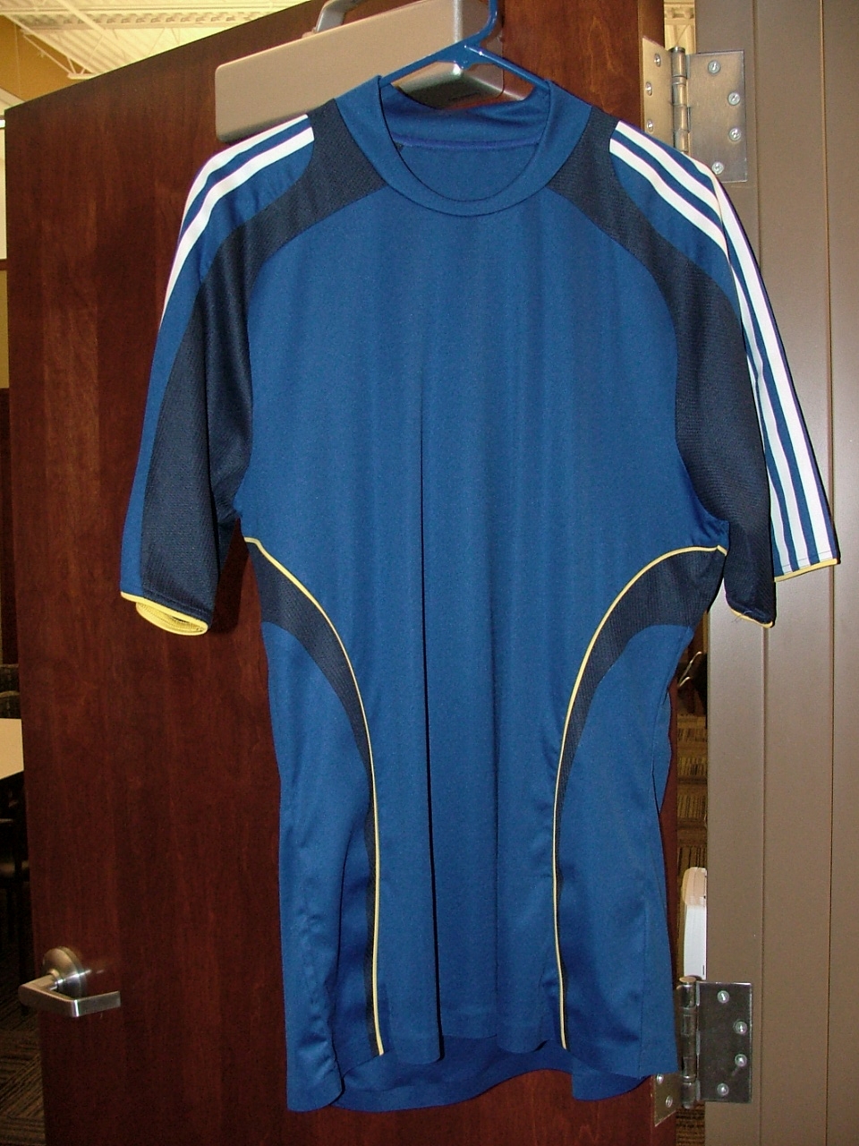
This picture is taken from Oz City, it's a picture of the Wizards jersey for the 2008 season. Notice the darker version of blue that's the main color, along with the almost navy colored secondary blue. Also, notice the yellow on the jersey.
Personally, I don't like it at all. I was against the change to a darker color of blue originally, and this just seals it. I'm sorry but that's not a Wizards jersey. The Wizards have a lighter color of blue. While it's not quite as dark as the new LA Galaxy jersey, it's way too close for my liking. To me it's basically a rip off of the Galaxy jersey with the yellow piping, just with a lighter blue.
Why did the team need to move to a darker blue? Of the 3 teams in the league that have blue as their home color, the Wizards had always had a lighter blue. Now with this new color, the team brings their shade of blue too close to LA and New England. What happened to having some individuality in the color of your jersey?
The hope of myself and of many of the others on bigsoccer after seeing the new jersey is that it's just a training jersey. But I have my doubts. Personally if this is the jersey I will not be buying one myself, and there are many others that seem to share that sentiment.


6 comments:
They didn't "Always" have the ligher blue... 96,97,98,99... and even the current "lighter" blue has changed "shade" at least once as this years blue was not the same as last years blue. In fact, I think it's changed twice.
I don't understand the righteous indignation about the color.
No actually the blue in the Wizards logo has ALWAYS been a lighter blue. Look at the old Wizards/Wiz logo.
And no the shade of blue has not changed since 2000. The blue, "Wizards blue" as the Front office and adidas have called it before has been the jersey color since 2000. It's been that same light colored almost Carolina blue for years now.
Are you a Wizards fan? If you're not then you wouldn't understand the "righteous indignation" about the color. The Wizards blue had been unique to the league, it was completely different then any of the other teams blue that they used. To change it to something that falls more into the same old style that other blue MLS teams have is what pisses people off.
waaaaaaaaaaaaah
Support the team. Sheesh. Don't even really know if it's the new jersey or not ...
And, Yes, the shade of light blue has changed. Didn't say it changed by much, but it did change.
Supporting the team doesn't mean you have to always agree with what the front office does.
And I have gotten confirmation that this IS the jersey.
I don't like it either.
But, I've never liked any of our jerseys. Or any of our team gear for that matter.
This one is better than those in the past, but there seems to be a lack of balance with the white trim/stripes on top and yellow towards the bottom.
I also tend to agree that there's no point being the third team with basically the same blue.
The blue is probably lighter than the picture makes it appear. If it's really Chelsea's cobalt blue, then that's perfect to me if it's more consistent.
Wizard's blue only exists in the Adidas catalog. It's impossible to match. I've tried.
Doing a lot of print work, if the exact blue is more consistent across all mediums, then it will be a big step up. I can't even imagine any big business not having their PMS numbers worked out before choosing team colors.
The problem with the jersey is the template and navy and yellow accents. That's what makes it seem like LA.
I would've liked to see them change to just the new blue with white for this year, and if they felt they needed additional color on the jersey, to wait until the next version.
Post a Comment